
Yoga. But More Flexible.
Or: making a website bendy as your Users

Client: yogaia.com
Brief: Increase new conversions
When: May 2017
Sprint: 2 weeks
Who: Steve, Loredana, Ali
Methods: stakeholder management; data analysis; competitor analysis; surveys; user interviews; current state testing; task analysis; affinity mapping; problem solving; user flows; user journeys; personas; scenarios; experience mapping; design studios; feature analysis; moscow method; site maps; sketching; paper prototyping; rapid prototyping; wire-framing; usability testing; remote testing; sketch; invision; presenting; design specs
Feedback:
"The team was amazing to work with and both the process and outcome have been very useful indeed! These guys are very skilful and confident."
Mikko, Founder, yogaia.com
"Extremely thorough research, great use of multiple methodologies to mine information - extremely insightful information... Great considerations in the iterations covering content / content strategy, labelling, and also information architecture in order to smoothen the experience - it’s great that you didn’t settle with something that you ‘thought’ would work based on previous feedback, but you validated at every step of testing iterations... Extremely sophisticated prototype - very detail oriented...an amazing piece of content strategy work"
General Assembly Instructor Team
yogaia.com is a premium live online yoga start up. Launched in Finland 4 years ago, the founder, Mikko, was an ex-creative finding it difficult to make time for the guided yoga that soothes and strengthens his back. The lightbulb moment was discovering that no one else was offering online interactive yoga instruction.
yogaia.com was born.
Background
After 2 years of growth it was time to expand into the English language market, starting with the UK. With far more competition from UK and US based sites, plus free services such as YouTube, yogaia knew it would be more challenging than Finland, but were confident their premium service and unique offering would win through.
18 months of solid UK growth followed, however as this began to slow yogaia considered the challenges they were facing. Excellent conversion and retention of core Users (ie experienced yogis) was no longer delivering the growth expected.
Our team were briefed to identify the problem and design a UX solution. We were asked to consider engaging new Users with the USPs, plus the journey through to a paid subscription. We knew we would need to use a wide variety of tools, following the Double Diamond method of Discover and Define, Develop and Deliver, creating a huge number of artefacts along the way.
However, yogaia were quite candid, and expressed that the problem may not lie in UX, but in their business model or in the heavily competitive UK/US market.
It was clear that our first step would be to understand yogaia.com, the landscape and the Users. Only then would we be able to define the problem.
Meet the team
Our team of three brought a wide range of experiences to the project, from media to advertising to editing.

And we all had different yoga experience too: Ali was a trained teacher, I was a beginner/intermediate and Loredana had tried it once some years ago. We would soon learn that the three of us were analogous to yogaia’s problems.
Discovery
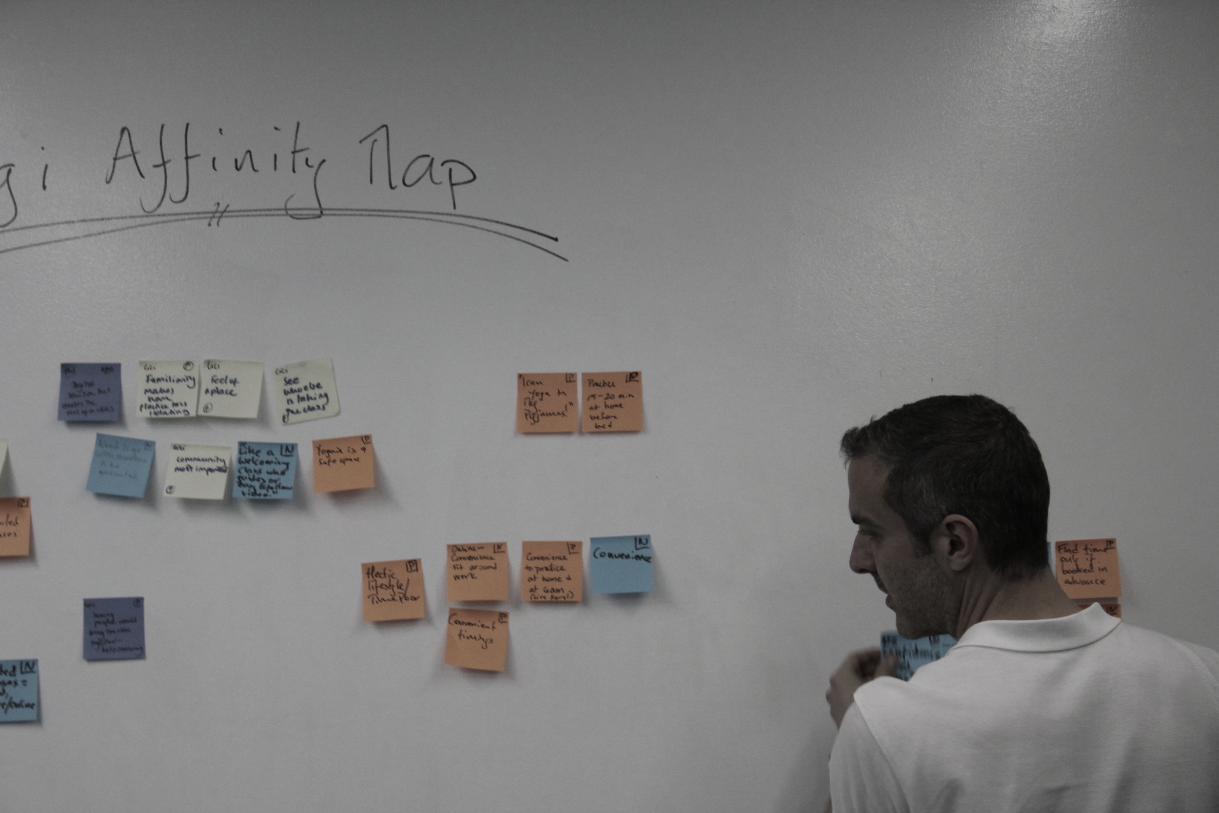
Some of the techniques we used included surveys and interviews, task analysis and current state testing, plus competitor and audience data analysis to give us a foundation from which to define the problem.
“How does it work?”
“I can yoga in my pyjamas!”
We uncovered a number of key findings:
there are 3 User types: beginner, intermediate, expert
conversion rates for beginners are half that of experts, but represent a much larger potential audience
our beginners audience struggled to understand that yogaia offered all the benefits but none of the barriers to trying yoga
This is a good point to introduce Phil:

Phil is one of the three personas we created, to represent our three different Users. While we would not be abandoning Olivia and Jill, Phil would be our main focus from now on. We purposefully created a Phil over a Philippa, despite 80% of Users being female, as a symbol of the change and challenge we would be presenting to yogaia. Phil is were our biggest opportunity lies.
We resorted to post its and whiteboards, a UXers natural habitat...
Defining Our Problem
To make sense of all our research, we applied a whole yoga retreat's worth of methods, including - affinity mapping, concept mapping, scenarios etc.
With a significant amount of research in our locker, we were getting closer to understanding the true problem.
To really help us understand and illustrate this, we followed Phil on an emotional journey with his first interaction with yogaia. Here is what we found:
A worrying experience map!
It's fair to say it was a bit of a roller coaster! Phil faced frustrations trying to find the information he needed, in a way he could quickly and easily understand. When Phil didn’t understand what he was seeing, he felt lost, insecure, doubtful and confused. And he left us disappointed. A potential customer lost. Put simply, our problem was:
New visitors to yogaia.com need a deeper but quicker understanding of the value and benefits of being a yogaia member, before committing to membership
Our rather ambitious goal was to turn this round so that Phil’s journey was more happy baby than reverse corpse.
Our hypothesis was:
Homepage education of yogaia USPs, using text, images and video, plus a minimal click purchase route with consistent messaging, will increase new User sign ups
We were now ready to start developing some ideas, and most importantly, testing them.
Designing, Developing & Testing
Our first step was a collaborative design studio involving all the major stakeholders. Fuelled by cake and coffee.
As the afternoon progressed we found a few common themes kept proving popular. By the end of the studio there was a hint of euphoria as we realised everyone understood the problem and agreed on a direction.

Sharpies + blu tac + coloured stickers = happy faces
Time to start prototyping and testing.
A combination of remote, guerrilla and face to face testing provided us with a fountain of feedback on each iteration, helping us develop each of the key stages of the journey.
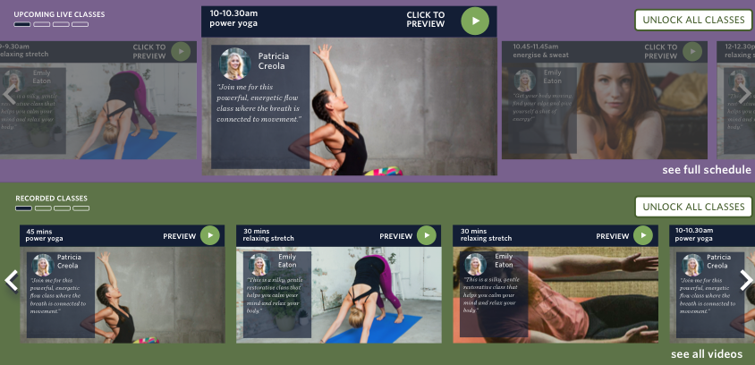
Some of our most useful findings led us to change the way we think about the homepage. We're not just a yoga business, we're also a content business. So we needed a way to showcase our content, to let the User see how we organise our content, and to invite the User to interact with it, all from the homepage. And quickly. And intuitively. So we shamelessly stole from Netflix and adopted a video carousel.
The feedback on testing was positive, with an overwhelming User understanding of what yogaia offered and what the User could expect and discover. We were starting to deliver our message in the way we hoped.
Our Users also helped tidy up the navigation, with feedback guiding a restructure of the primary and secondary navigation

Users guided us to change a desktop hamburger menu and simplify the secondary navigation
One of our key focuses was subscription. Testing had told us that there were too many steps and Users needed continual assurances throughout the process. So we listened to them.

Users needed the sign up all on one page, with reminders of the benefits to them if they signed up
Through each iteration we kept evolving and learning from our Users, until we were in a position to up the fidelity and begin testing a mock up. The results were strong, with some Users thinking the mock up was a live site! Have a click through the gallery below or click the link underneath for the prototype.


Have a look around here —https://invis.io/BVOOWA759WY
Delivering
Early in the process the client began to implement some of our recommendations based on the regular projects updates and interpretations of our findings and designs. With the final design spec document delivered, yogaia approached us to continue the project as well as joining them as they expand into the US market. We'll be focusing on 3 key aspects:
The mobile journey for each User
The US mobile site
How optimising for one User may affect the journey of another
And finally, I’m pretty sure that my work with yogaia will help me progress from a beginner yogi to an intermediate, one downward dog at a time.