
wagamama - optimising a design system
improving usablity and buildability
CLIENT: wagamama
BRIEF: review a new design system in readiness for build
WHEN: spring 2023
SPRINT: 3x 2week
WHO: STEVE (design lead), Rupa (ui), Holly (research), jags (head of e-commerce), Shayla (ba), craig (vibes + delivery), Andy (dev)
METHODS: design system optimisation, ui, ia, user testing, journey mapping, stakeholder management
FEEDBACK:
WHo: Andy - technology director
What: design system review/web redesign
“Steve is clearly very passionate about the most important element of the website – the customer experience. He brings great energy and contribution to the meetings both in person and on-line. In terms of taking the business stakeholders on the journey with us, Steve’s role is going to be key. I’m looking forward to him bringing the guest journey to life”
WHo: Jags - head of digital & e-commerce
What: design system review/web redesign
“Steve has been great to work with throughout the process so far. A great personality with valuable insight and knowledge that has helped us firm up certain areas of our experience and design. I’m looking forward to continuing working with him.”
WHo: Dave - head of business analysis
What: design system review/web redesign
“Steve has been great to work with through the discovery process. His knowledge and passion for what he does is evident and he provided valuable insight and challenge throughout. We are all looking forward to working with Steve as we move ahead”
As wagamama’s newly appointed technology partner, our first work together was to re-platform and build a new uk website, using designs recently completed by one of their partners.
Also, everyone likes wagamama, right?
Background
wagamama is/was at the time owned by The Restaurant Group, a business with a bunch of high street restaurant brands in the group. wagamama was the jewel in the crown, one of the most well loved and recognised high street eaterys. Its easy to forget just how revolutionary they were when launched - great, tasty and fresh food, at a good price.
As our clients were repeatedly happy to point out, they are not a technology business, they are a food and customer experience business. Basically, “we do noodles, not tech”. A key part of our relationship involved working collaboratively and transparently.
Brief
Their design partner had produced a design system and screens. My initial brief was simply to review the designs ahead of build. I did this by asking myself a few questions:
how well do the screens and journeys conform to usability conventions and heuristics?
how well do the designs meet accessibility standards?
how easily might the dev team navigate the figma files?
where could I improve?
how would I prioritise improvements?
The answers to all these questions led to a subsequent brief, which was to rapidly put together a small team to deliver design improvements. We had to have the first tranche of work ready for dev within the time it took the dev team to spin up and get ready, and then staying half a sprint ahead of them. And to have the whole lot done in the time it takes boil some noodles. No pressure then.

A not very enlightening screen shot of a design system
Discovery
Discovery ended up being a bit surprising and leading to some awkward and diplomatic conversations.
Our design system and screens were beautiful. Glossy, on brand, mouth watering. However there were a few things that felt a bit off, felt awkward and icky. Some of the colours, some of the layouts, some of the component structures, the labelling etc. So I got a second and a third opinion.
And unfortunately I was right. The designs were beautiful, but still had quite a way to go to meet the standards we set ourselves. eg - they failed accessibility, had been designed and tested desktop first (where most traffic was mobile), and were challenging for dev to use.
However, they really were very lovely! And we didn’t have the time, budget or desire to attempt a revolution.
So we set about evolving it. Which meant identifying the biggest user wins, the biggest dev wins and cross referencing them so that we could prioritise our limited design time.
We ran a series of meetings with stakeholders to understand the brand constraints, the ambition and the thinking behind certain design choices. We looked at the existing research, and we looked at how competitors approached similar problems. We worked closely with dev and BA to t-shirt size the designs.
All of which gave us a recipe for evolving the design system and screens.
Design
Our Michelin starred design team of me, Rupa and Holly set to it. Holly ran some guerrilla testing on areas we had prioritised, giving us some clear primary user feedback. This helped us win hearts and minds, giving evidence that supported our expert view. Luckily, wagamama strongly believe in the voice of the customer, so our user first approach meant we were able to focus on what could be done, rather than why we should do it.
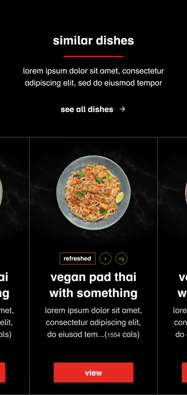
Little things can have a large impact
This carousel took time and effort to get right, as we explored the cascading impact of proposed design upgrades.
For example, we tested and proved an assumption that most people will scan the screen for the things that are deal breakers. In this case, whether vegan, vegetarian, or to a lesser extent the type of dish.
The tags you can see were originally lost next to the button. Moving them higher in the hierarchy gave them greater impact, but also had a knock on effect to their relation with the other elements.
And we wanted to keep consistency beyond this screen, as well as between mobile, tablet and desktop. Which meant tweaking and critiquing, refining and testing until we got it right.
A small thing, perhaps. But one that could have a significant impact on customer experience and conversion rates.
We set about updating the designs. Rupa and I pushing pixels, Holly testing with users. There was nothing revolutionary in our changes, nothing that broke the mould. There were a few tense conversations with stakeholders, eg we insisted on making it accessible and optimising for mobile. Equally there were unexpectedly easy conversations eg around use of colour, using fewer animations.
We reorganised the design system, re-labelling where necessary so that the file was easier to navigate. We also annotated and and laid out some rules for use. Going above and beyond to help future designers, marketers and developers make the most of it.
You can head on over to www.wagamama.com to see it in action and how it might have involved since then.
What would I do differently?
Given the time, budget and brand constraints there is nothing I would do differently. Apart from maybe spend more time hanging around the wagamama kitchen, hoping for scraps when they ran new dish experiments.
This was a simple yet satisfying piece of work, focusing on the detail in the UI that had the greatest impact on the user experience, and the greatest impact on client outcomes.